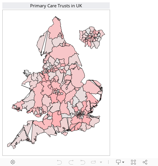
It's been well documented that Tableau doesn't allow for choropleth maps to be used out of the box. Below, I've played around with using quasi-shapefiles that I've created from a pdf (don't ask) to get somewhere very close to a choropleth map in tableau (the weird looking bits are down to islands and holes within the pcts).
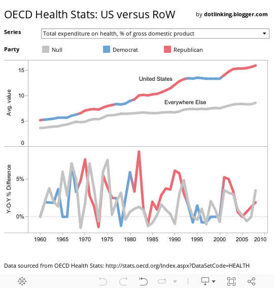
I came across the following chart via the Marginal Revolution blog, it is quite hard to see much beyond a blur of flags - while it goes some way to illustrating the US massive spend on health as a percentage of GDP, it does little else.
I've download the data from the OECD website and used tableau public as my tool of choice and the interaction element that it provides. Interestingly, it is 1982 when there's the biggest increase in health care expenditure (as a proportion of GDP).